
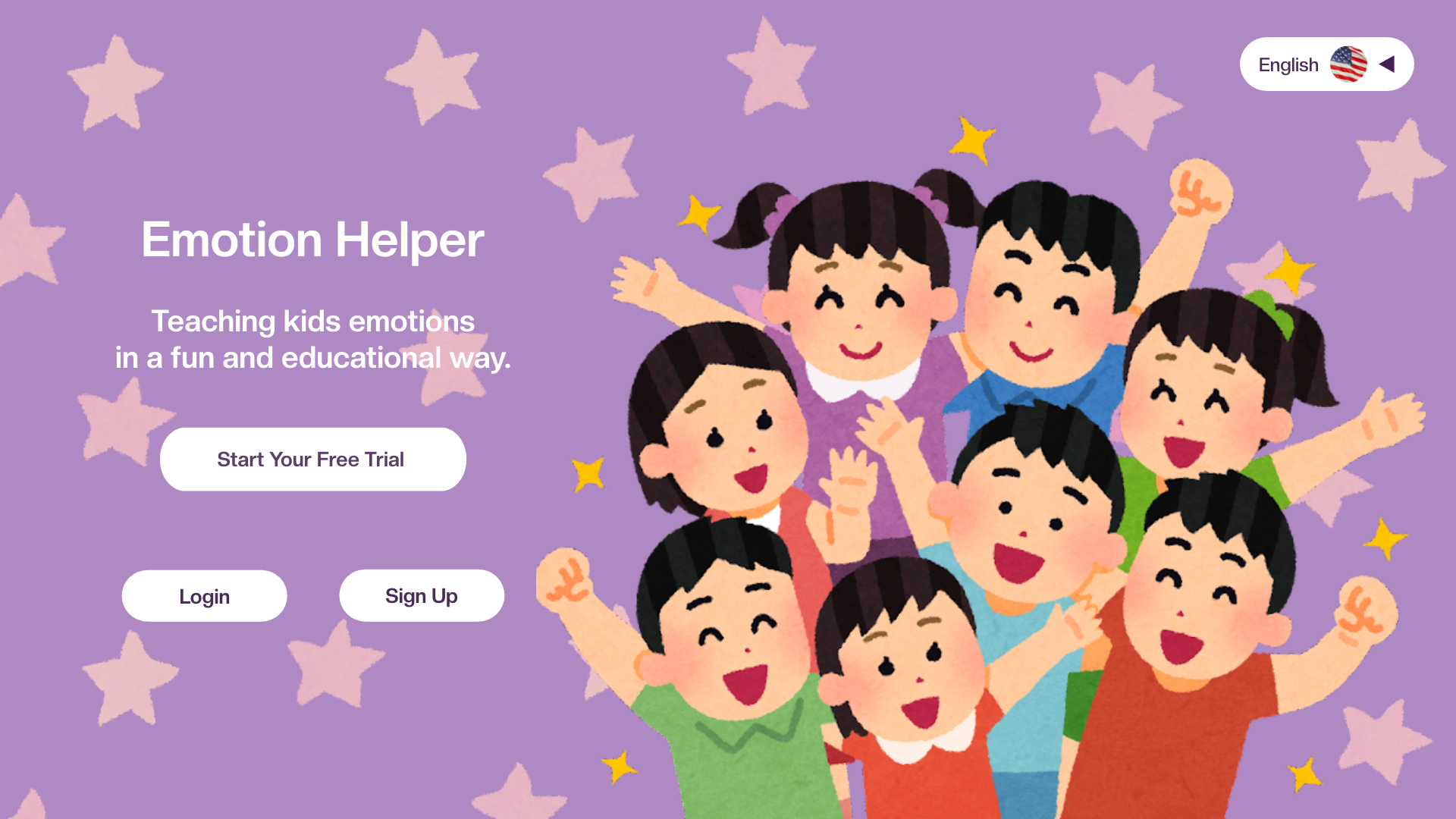
Emotion Helper is an app that helps kids ranging from 4-8 years old learn about emotions and teaches them how to handle their own emotions and understand other’s emotions. Adults would have to log in and from there they can create different lesson whether personal or in a teaching environment. My role was being the UX researcher and UX designer from doing research, to interviews, to wire frames and prototypes.

Challenge: Emotional development is important for children to understand themselves and to learn how to respond to their feelings. Most learning programs for children emphasize knowledge, and a program focused on understanding emotions would be a useful educational tool for children, teachers and parents.
Goal: Create an app that helps kids learn about emotions, how to handle their own emotions and how to understand other people’s emotions.
Research: I am creating an app/website for kids but because majority of kids wouldn’t be able to login into their own account and make their own lessons plans, I created it for adults and children. I wanted the adults to be able to create a lesson plan for the kids and from their kids can have fun and learn about emotions. I noticed after researching different education sites for kids between the age range of 4-8 years old that the login screens are made for either parents or teachers. After signing in or logging they have different categories to teach students or kids but I wanted to specify in emotions. One non-direct opponent I researched was Duolingo since it is a learning app/website.
My target audience is mainly for kids between the ages of 4-8 years old but to login/sign up would go through an adult.
Design Concepts:


When it came to design concepts, I wanted to keep the login/sign up screen to be straight forward but when it got passed those screens I started to have trouble sketching out how the other screens should look.
Left image contain rough sketches of the main screen after the login/sign up screen. I struggled with how I wanted to layout the content that the teacher and the students would see since I was working on the teacher point of view. I wanted to make the kids have a fun visual learning experience since students come from all different backgrounds.
On the right side is a rough wireframe of how I wanted the login screen to look like. Since I tried to go for a more simple approach, it looked plain.
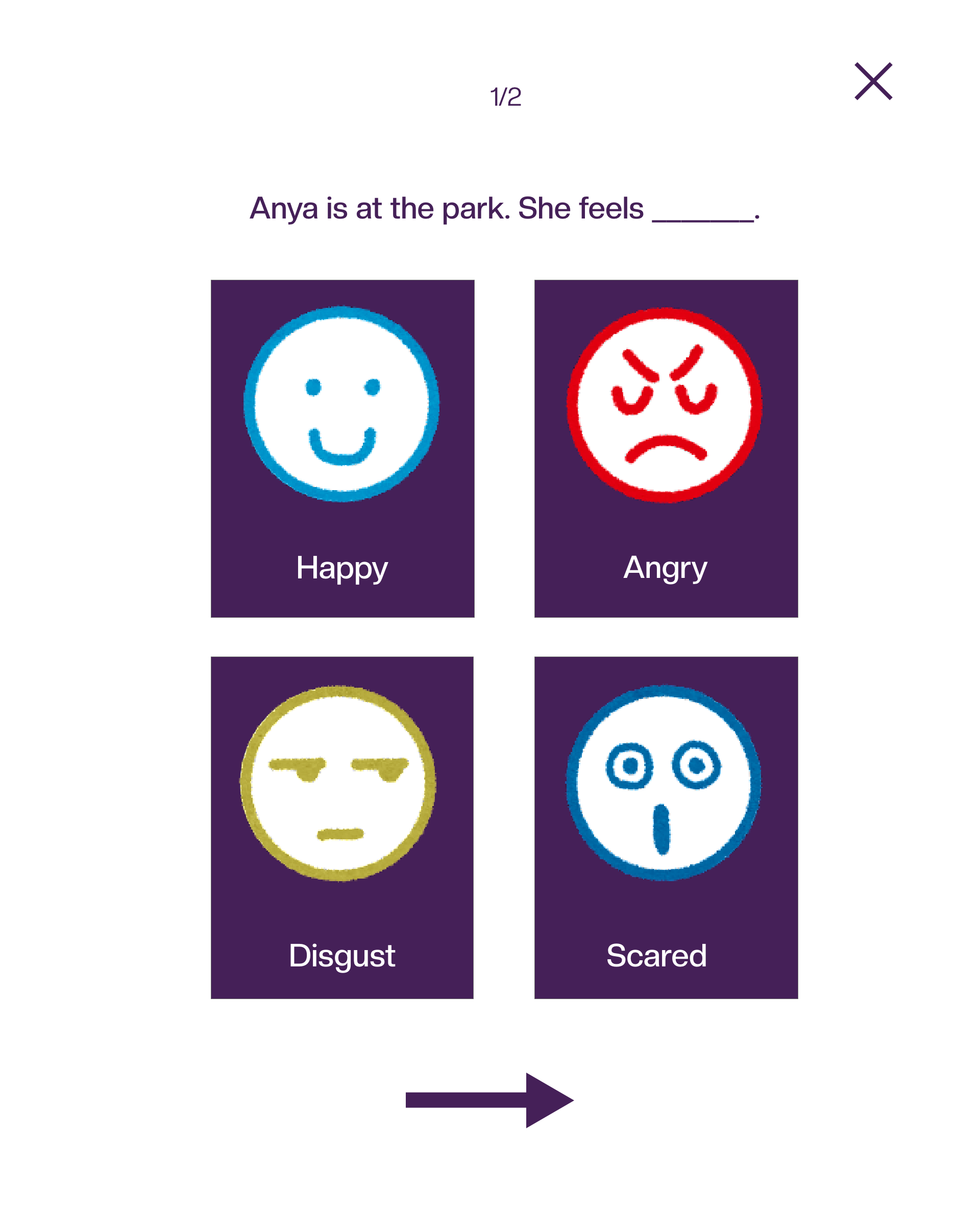
Testing: I interviewed 5 different participants who all have different backgrounds and range from parents to teachers. This was an unmoderated study. Most participants had a very hard time with the main screen that the teacher would see. They also mentioned since this was a teacher POV (point of view), would the students be seeing the same things as the teacher which was a great point and issue I knew I had to adjust. Another thing was with lesson plans since it would be more organized for the students/kids to go through but I did not create an area for the teacher/parent to create one. Since my app ranges from 4-8 year old children, each age would go through different lessons. A few of the participants mentioned that it would be helpful for the students/kids to learn emotions through different scenarios since it would give the kids a chance to also learn about other peoples emotions and their own.

After asking the participants for feedback, I organized them into priority 1-3.

Few of my participants were teachers and they recommended having units to lessons and a customization feature in the settings (located in profile). Creating a sitemap with that info made things clearer.

How the lesson plan originally looked like after the teacher has signed in.

When the lesson is done. Whichever lesson is done it would have a color change.

The lesson in progress with the correct answer.
Before and After Usability:

Teacher POV now have units, lessons, grades, and more with a presentation mode for when the teacher needs to present the lesson to the kids. Presentation mode helps the teacher show the lessons to the students without having the students see what the teacher sees.

High Fidelity Prototype:


Test out the High Fidelity Prototype Here
“This is a really interesting concept. I would love to see this as an actual app. I think what would be useful is providing a hearing option”.
“Since your website is toward such a young audience, maybe provide an incentive for them when they get the answers correct so it’s more fun for them. I really like how bright the colors and characters are. It looks inviting for the kids”.
I learned more about children’s learning programs and how they work. After studying some of these programs and what accessibility is offered to kids whether school or at home environment.
The next steps I would take is to keep working on the app/website and get more feedback on how to make it better since this was a big challenge for me. I also would work on more accessibility options such as hearing options and screen readers. Another thing I think would help the kids stay focused is to add an incentive for them when they get all the lessons correct.