
I interviewed some potential customers to get their feedback on their likes and dislikes of different bakery websites they have tried. They ended up saying how some sites were distracting with all the different things they were trying to promote.They wanted to something that went straight to the point and they can see the items quickly and easily. My role was being the UX researcher and UX designer from doing research, to interviews, to wire frames and prototypes.
Challenge: Bakery sites sometimes have too much going on the homepage and they don’t offer the option to add more items.
Goal: To make sure that customers are able to add as many things they want in case they change their minds and make the experience of ordering online is easy.
Research: While doing some research on different bakeries, I noticed that most bakery website homepages have a lot of info and images shown but it looks more cluttered than it does helpful. Another thing I noticed is when going through the different categories, if provided, it takes you to a whole new page but no way to go back so you would have to go back to the homepage vs. just clicking a button that can take you back to the page you were on.
My target audience would be aimed toward people between the ages of 18-60+ or for anyone who likes to eat baked goods.
Design Concepts:
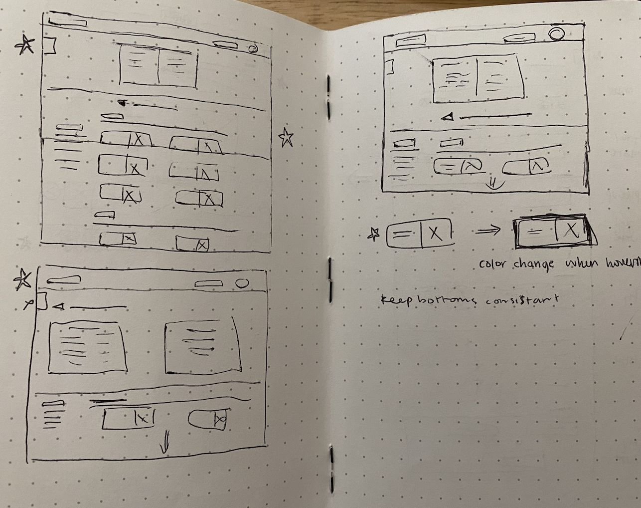
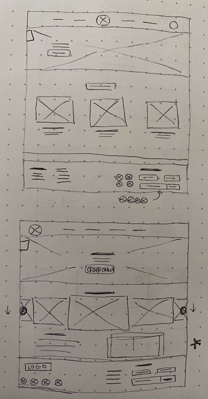
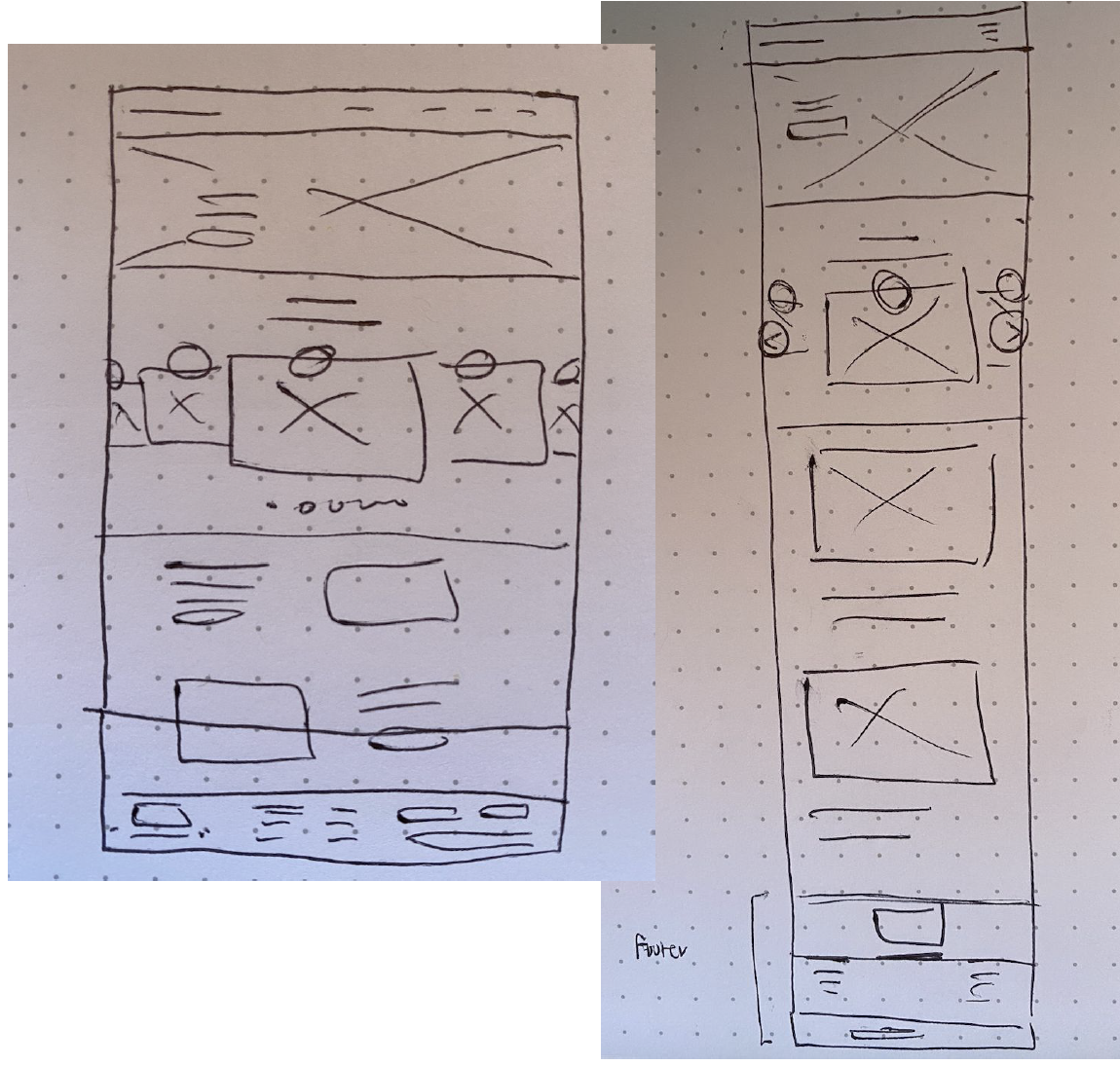
I drew some rough sketches of some ideas I had and listed some common items I saw with other bakeries from my research.
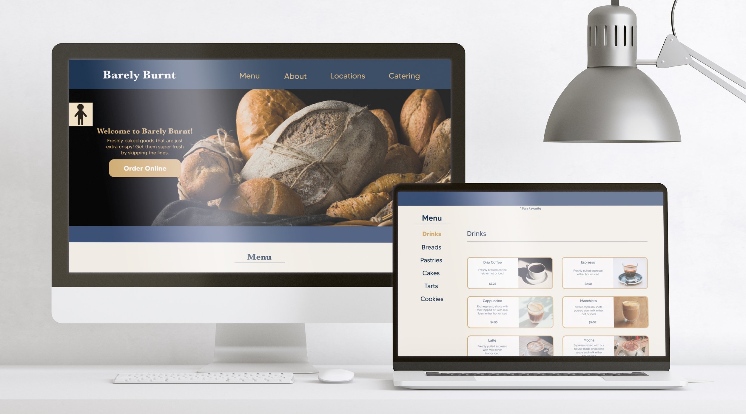
Homepage: I wanted to have the “order online” button to be pretty bold and then have the other items such as menu, about, and etc to be readily available in case the person using the website didn’t know what to order yet.
I tried to make the home page visually appealing but without overcrowding the screen with too many images or too many words. I also wanted to have visuals since it draws attention but also attracts hungry people.
When it came to resizing the screen from website to mobile, I wanted to make sure they stayed consistent with the same information and same rough layout.
Testing: I interviewed 5 participants to test out the digital wireframe version of my website and told them to focus on the pickup option. Most participants said it was easy to use. All participants said that when they got to the “checkout” screen, they wanted to input a time and date but was unable to, so I took that into mind of making sure that option was available. Participants also mentioned it would be helpful if the button icons changed color since they couldn’t tell if they clicked the button (they did since it went to the next page). Another minor comment was that when it came to the confirmation screen, all participants said the “take me back home” button was more for an app than a website. They recommended to delete the button.

Date and Time have no adjustments.

When clicking the button does not change colors.

Go back home button isn’t needed.
Before and After Usability Study:
After taking consideration on the participants concerns, I created a calendar and time slots so for future participants they are able to adjust what day and what time to pick up an order they put.
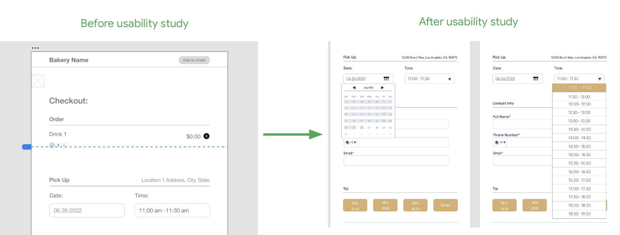

I removed the “go back home” button for the website and made the logo as the go back home button.
High Fidelity Prototype:


Test out the High Fidelity Prototype Here
I learned that making sure that buttons are easily accessible and having the buttons change color is a good way to indicate on what the user is clicking. I found its very important to know what the user needs and what can help them along the process.
My next steps would be to have another round of participants test out the hi-fi prototype and hear what feedback would need to be changed or added and keep expanding on what can be done to improve accessibility.