
I created a boba app to help those who love to drink boba but being able to avoid waiting in lines or being able to stay in the comfort of their own home. My role was being the UX researcher and UX designer from doing research, to interviews, to wire frames and prototypes.

Challenge: Waiting in lines can be a pain and a waste of time or sometimes you don’t want to leave the house but really want a treat.
Goal: To make it easier for those to want to get boba efficiently or be able to get it in the comfort of their own home.
Research: While doing some research on different boba shops and other drink shops I noticed that a lot of apps, specifically, did not have a delivery option. I also noticed they did not offer any accessibility features on the app but offered on their website.
My target audience would be aimed toward people who are teens- adults or for anyone who enjoys drinking boba.
Design Concepts:
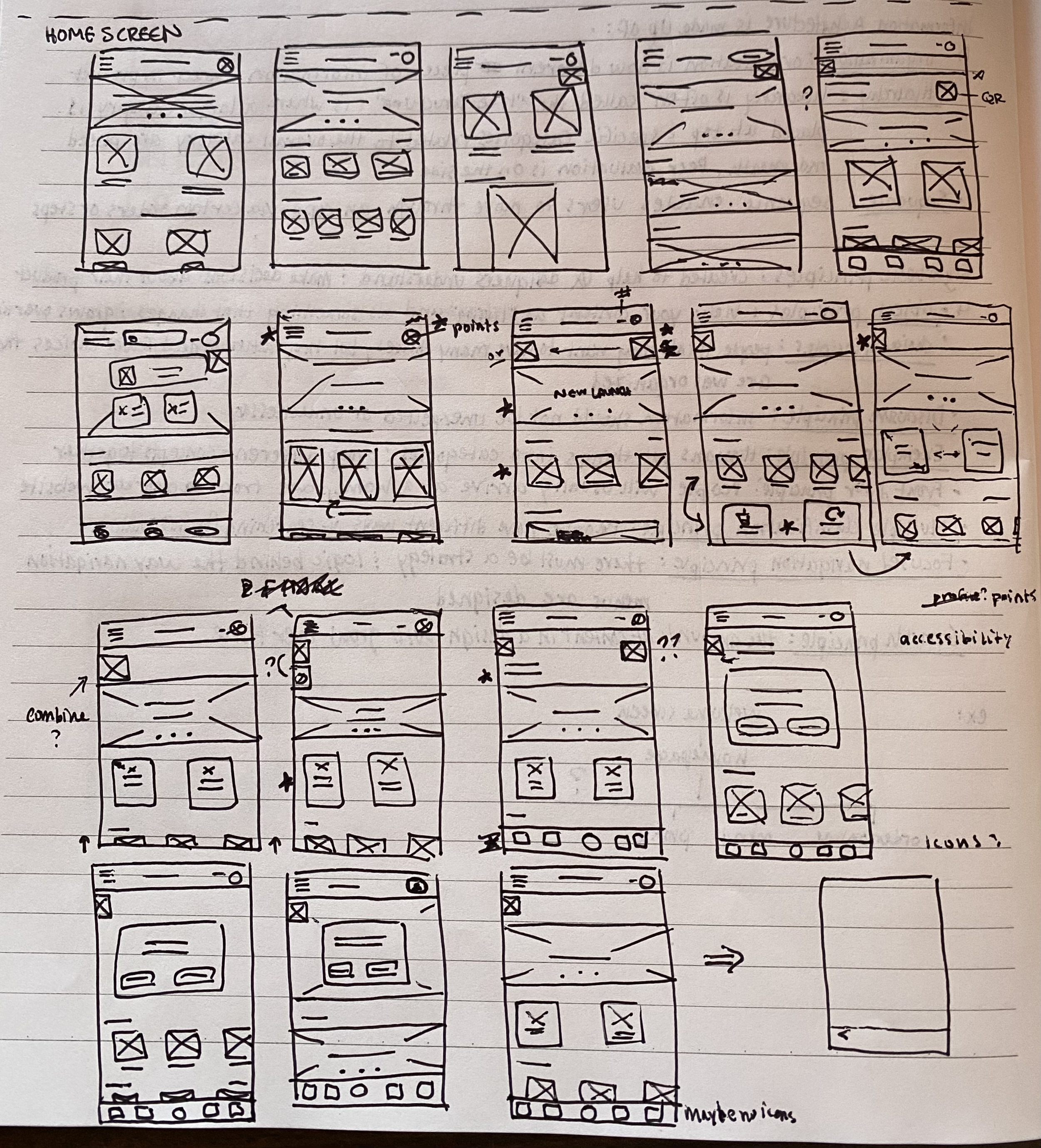
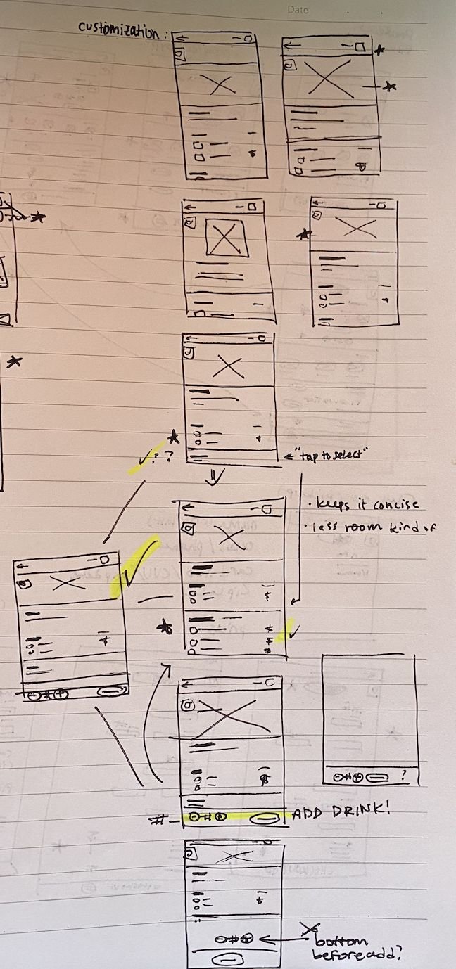
I sketched out some ideas and played around with placement of certain buttons and images. I also wanted to make sure an accessibility option would be available on majority of all the pages that was being provided in the app.
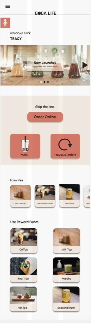
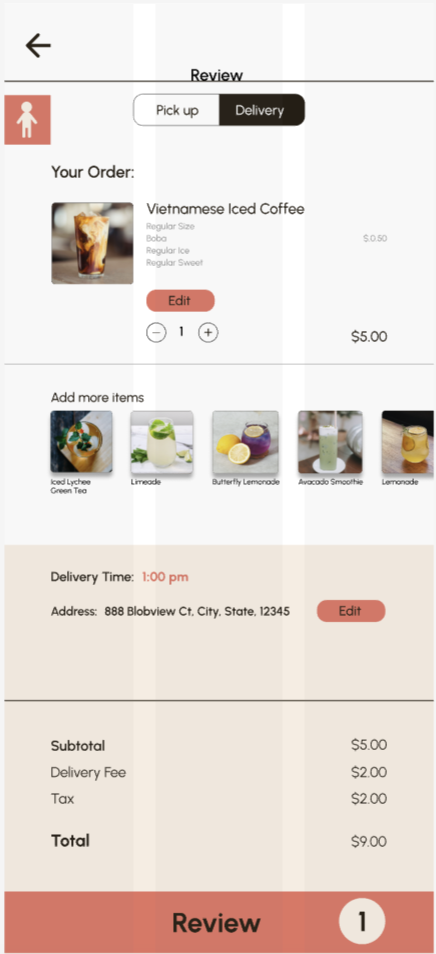
For the homepage, the items I was very adamant in having were the order online button that was easy to see and make sure the button was obvious to click. The other item I thought would have been helpful that some other boba apps did not have was a “previous order” option or somewhere to re-order.
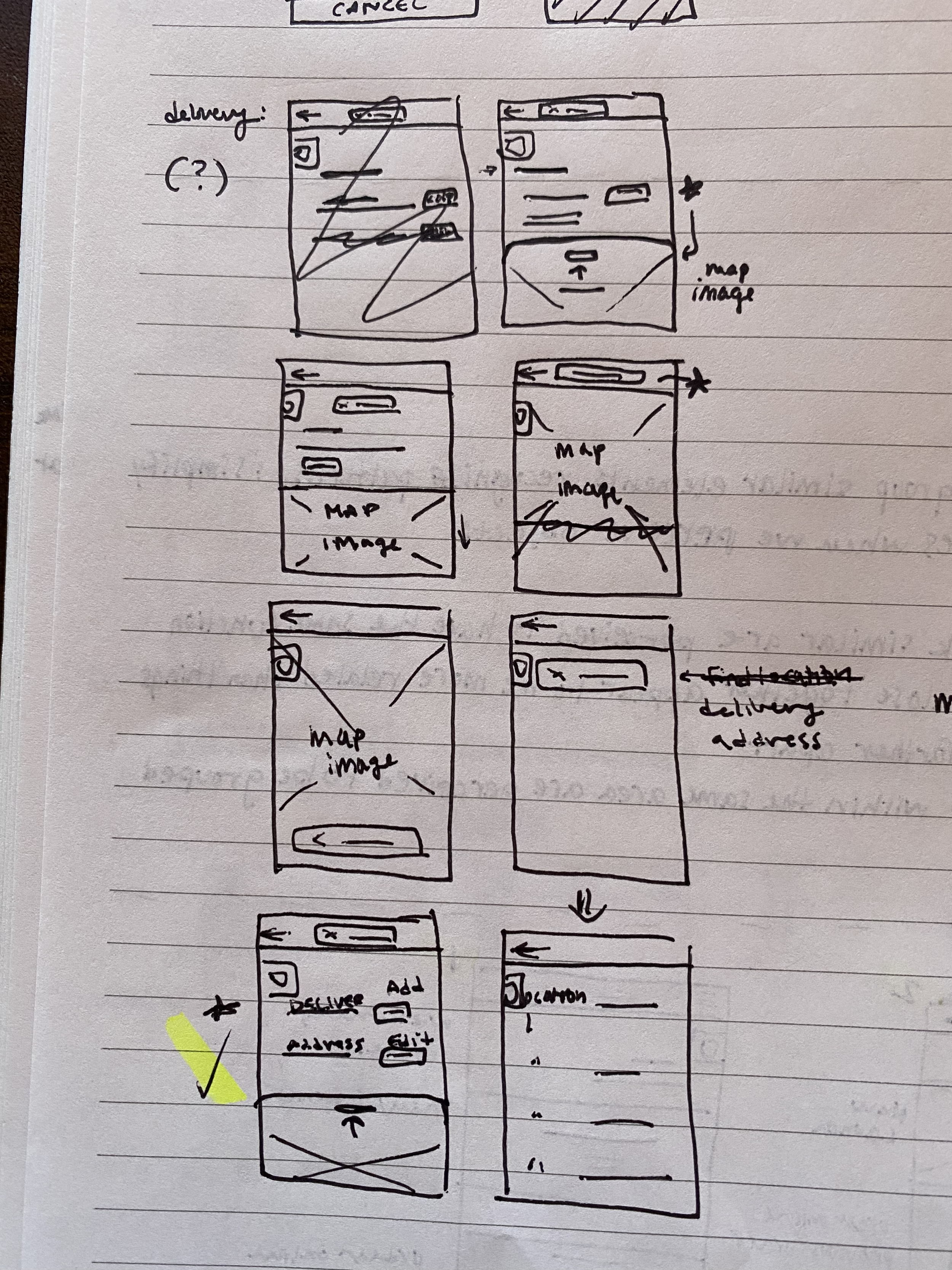
For the delivery page, I was thinking of providing a map and a search bar for people to put in an address to get an exact location.
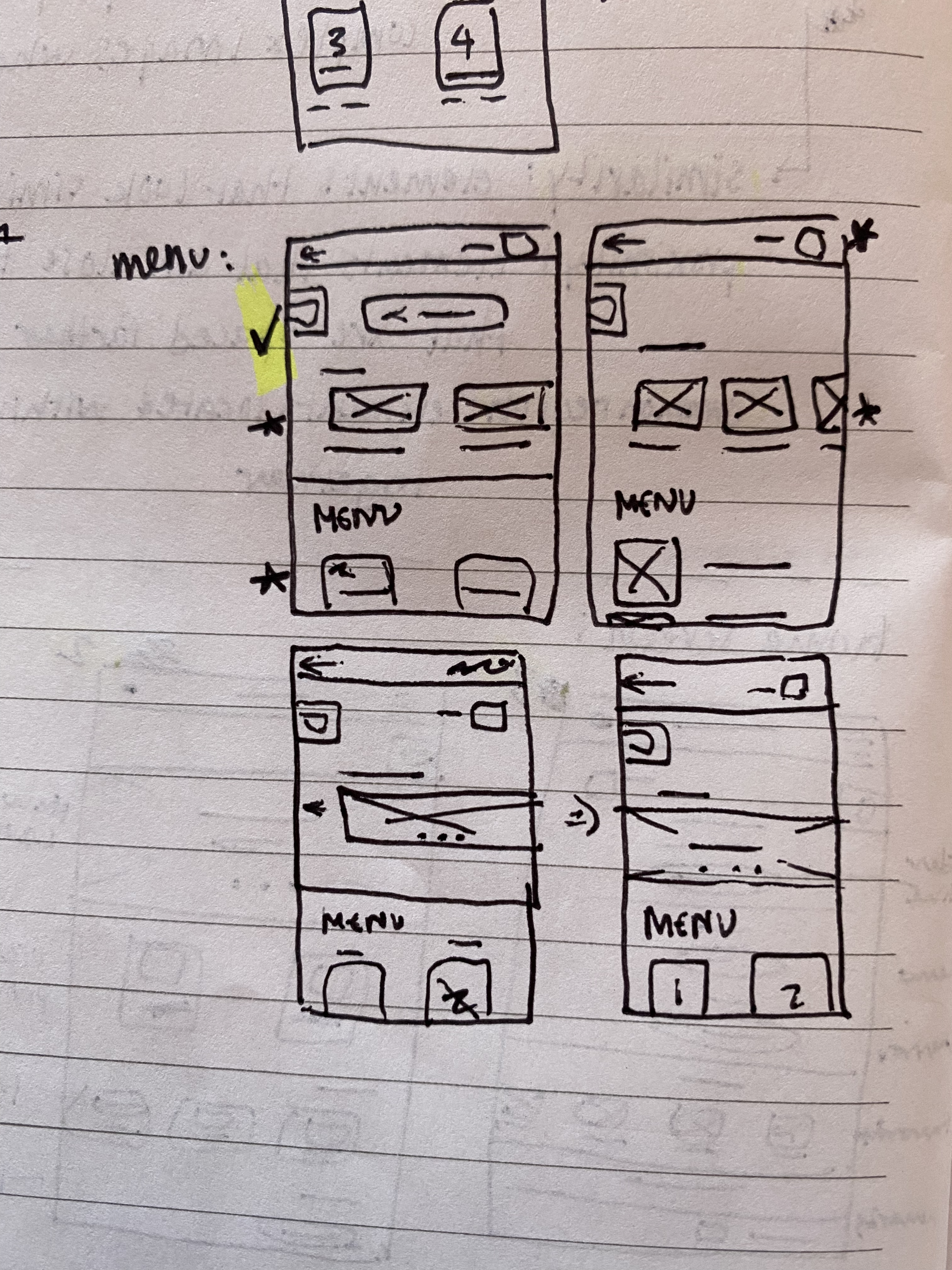
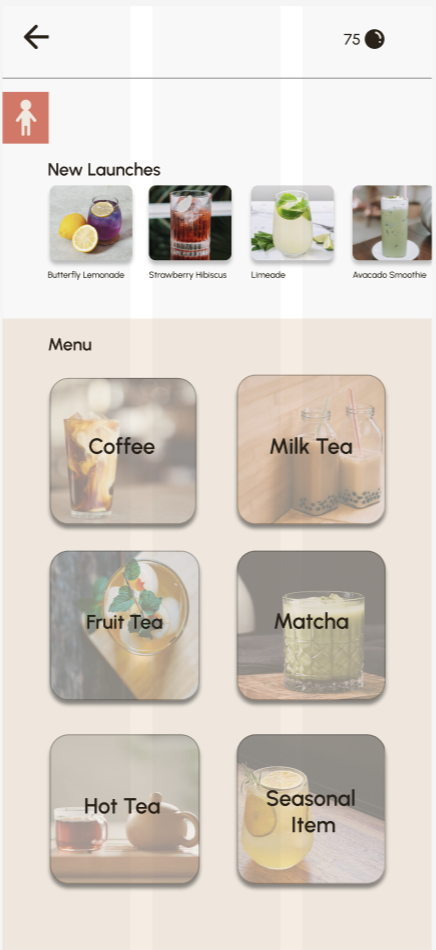
For the menu page, providing images was super important to me since sometimes it is hard to imagine what the drink would look like.
For the customization page, being able to edit your drink how you would like it was a good standard to have and a lot of the apps I researched did have great customization options but I still wanted to have an image visible for people who would still want to see what the drink looks like.
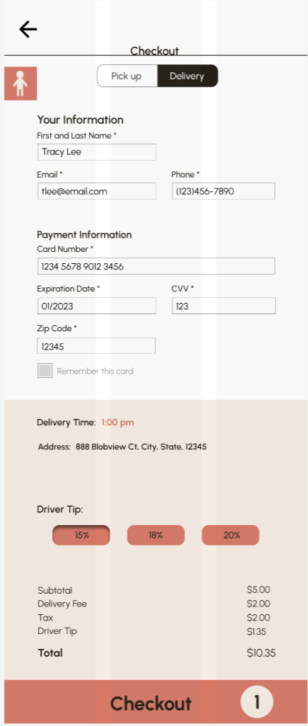
Testing: I interviewed 5 participants to test out the digital wireframe version of my app and told them to focus on the delivery option. All participants had a hard time getting passed the “address” screen since they did not know where to click. Another issue was the “checkout” screen being shown 3 times in a row and confusing the participants in why it was not going to checkout. After getting feedback from the participants and organizing everyones frustrations into categories, I got to work to improve my app.


Before and After Usability Study:
After interviewing and organizing what majority of participants had an issue with, I focused on fixing the major issues first. The two main issues was the delivery page and the checkout/review pages.
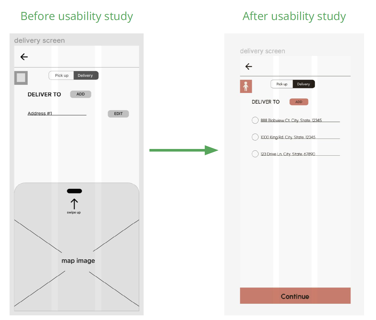

Since participants were having a hard time getting passed the delivery page, I got rid of the map option. I still wanted to keep it but because it caused confusion I added the “add” button so when someone would click it it could lead to a map image and also provide a search bar (not shown). After an address has been added it would be saved for convenience.
I changed the “Your Order” page to a review page since that page technically didn’t check you out. I wanted to provide a page for someone to review their order in case they needed to change or edit their order.
High Fidelity Prototype:
Test out the High Fidelity Prototype Here
“The app is really nice and I appreciate that there is a delivery option and images to each name”.
I learned how important it is for apps/websites to offer an accessibility option. During my research a lot of apps that I studied did not offer any accessibility help. I learned a lot about how important it is to make sure your app/website is accessible to everyone.
My next steps would be to finish up the pick up side and having participants test out the pick up side for feedback.